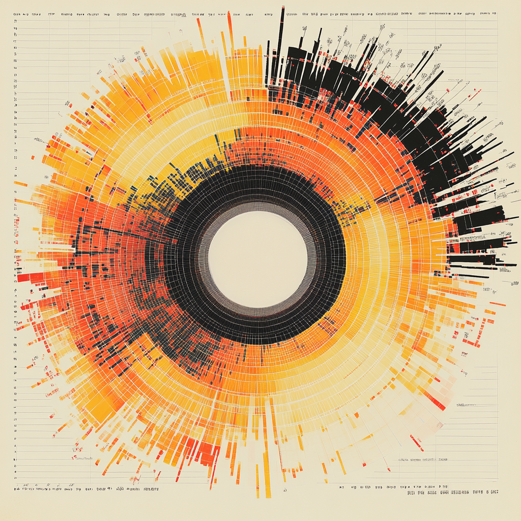
We all love a good chart. When we open up a slide show and skim through it, we always stop at the impressive-looking chart. Nothing says, “I know what I am talking about,” quite like a sunburst, rose coxcomb, spider chart, wheel diagram, or circular bar plot. All of us when presented with something complicated, immediately think this is a great candidate for a good doughnut chart. Some of us may have had a moment in our careers when, after staring at a chart such as this, we finally understood the messages being conveyed and were quite impressed. Visualization aids such as this are what we like to pay high-priced consultants to provide to us as evidence for their billable hours.
There are times when complicated data sets need to be expressed using a chart like this. Some of them were designed for this intended purpose. For example, when showing a directional component like wind and overlaying that with wind speed, a specific type of polar area chart called a “wind rose” might be used. When you are displaying time-series data that repeats in given intervals, people will use a spiral chart. This has proven as an effective way to display this type of data. A sunburst chart is often needed when trying to represent data that has levels of hierarchy that can be designated by concentric circles. So yes, these charts are effective at displaying specific data sets in an easier way so that they can provide an appropriate illustration.
What they are not good at is being used in your sales literature to explain your overcomplicated sales pitch. I understand; I have been tempted, too. Who can pass up the opportunity to wow a customer with an amazingly complicated wheel with various exits and entry points? I usually think in my mind, this looks amazing. This must be intelligent. Therefore, I am going to put it in my sales pitch so that I impress my potential client with a complicated wheel. Just this year, I have probably seen at least 30 sales presentations, and every one of them has a wheel or similar chart to explain their product or service. The fun thing to realize is that no one really wants to spend time on the chart. They want to flash it real quick, say something, and then quickly move on. The intention is to impress, not actually to convey meaning. The fact is the meaning is too complicated to get to without specific instructions to explain the nuances of the chart and how to navigate it. There are usually paths that the reader will need to follow to derive useful meaning, and because no one has the patience to do that, it becomes yet another obligatory wheelchart, we see in PowerPoint presentations these days.
What I do not think we as sales people realize is that most people are not impressed by this at all. People are usually impressed by someone who can make the extremely complicated simple. That indicates there is value present. Simplicity is the outcome, which is ultimately what most people will pay to get. When you show a complicated diagram, you are saying that you live in the complex just like the client does. If the client hires you, then you will understand the complexity, and you will have a complex process to help them continue to produce complex outcomes. This is the opposite of what most people want. I think we forget, sometimes, to really take a look at a presentation from the client’s point of view. How much time do you invest in a slide that a salesperson that you do not know or trust shows you? I tend to be naturally curious, so I might spend a little more time than others, but I average less than 5 seconds per slide. If I do not get the meaning of what is trying to be said in 5 seconds, then I immediately disregard that concept and usually do not come back to it. What always wins me over is an indication that what is complex in my world can be reduced to the simple.
I am not alone in this. In fact, due to this overwhelming truth, you may want to skip slide presentations in initial sales calls altogether. When you talk to someone for the first time about your solutions, all you are really trying to establish is whether it will be beneficial to both parties to continue talking. That is it; you should not be trying to check off hundreds of invisible checkboxes during a presentation. The worst thing you can ever do in a sales presentation is to tell the client, let us move on. I have a bunch more slides to get to. If you do need slides, they should convey major concepts in as simple as format as possible. They can be visually striking, they can have a pretty picture or two, but they should be simple. Any given slide in a sales presentation should only convey one major idea; if you are adding other items, including the kitchen sink, then you have failed.
So, contrary to our instinct, a complicated chart does not build credibility. A chart of this nature is used to represent data in a meaningful way, not to convince people to buy products or services. An attempt to use something like this is an attempt to take shortcuts with trust building, and that just never works.


Fascinating topic, Guy….thanks for imparting your take on the subject.
Thanks!